IQAir
Rendre visible l’invisible
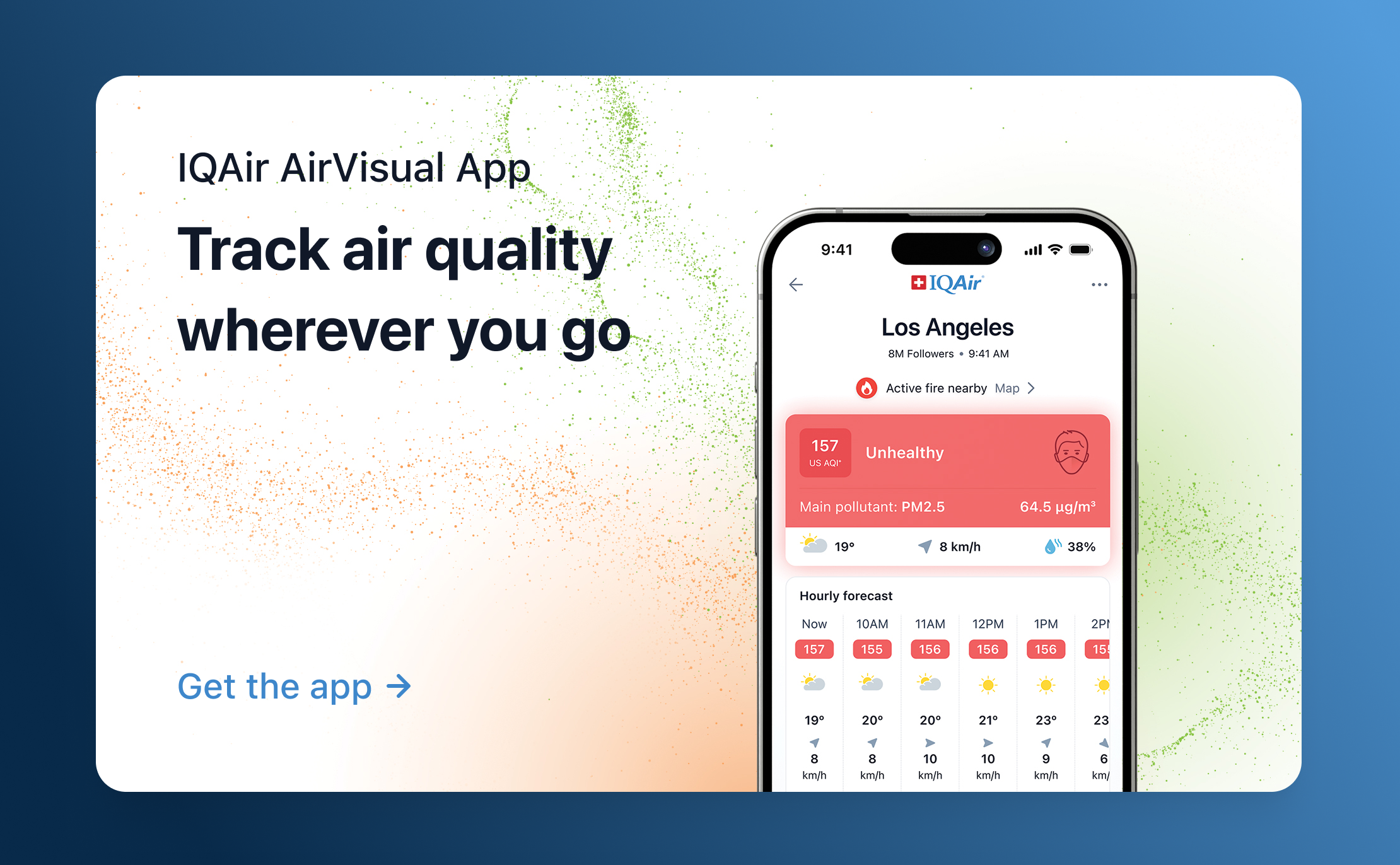
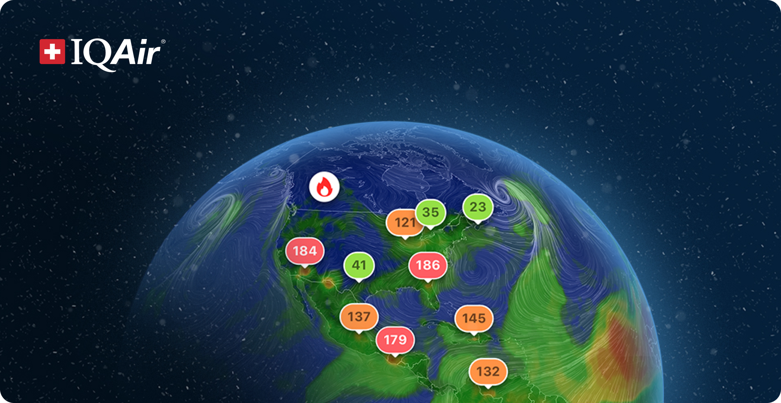


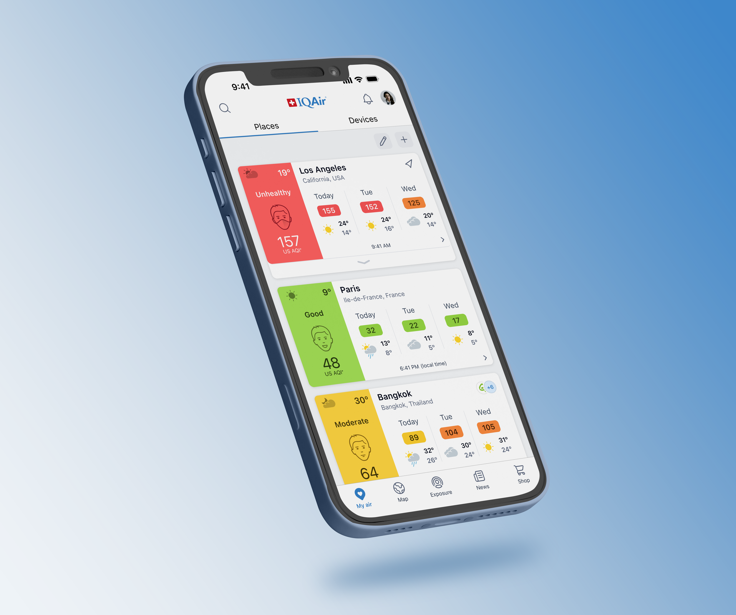
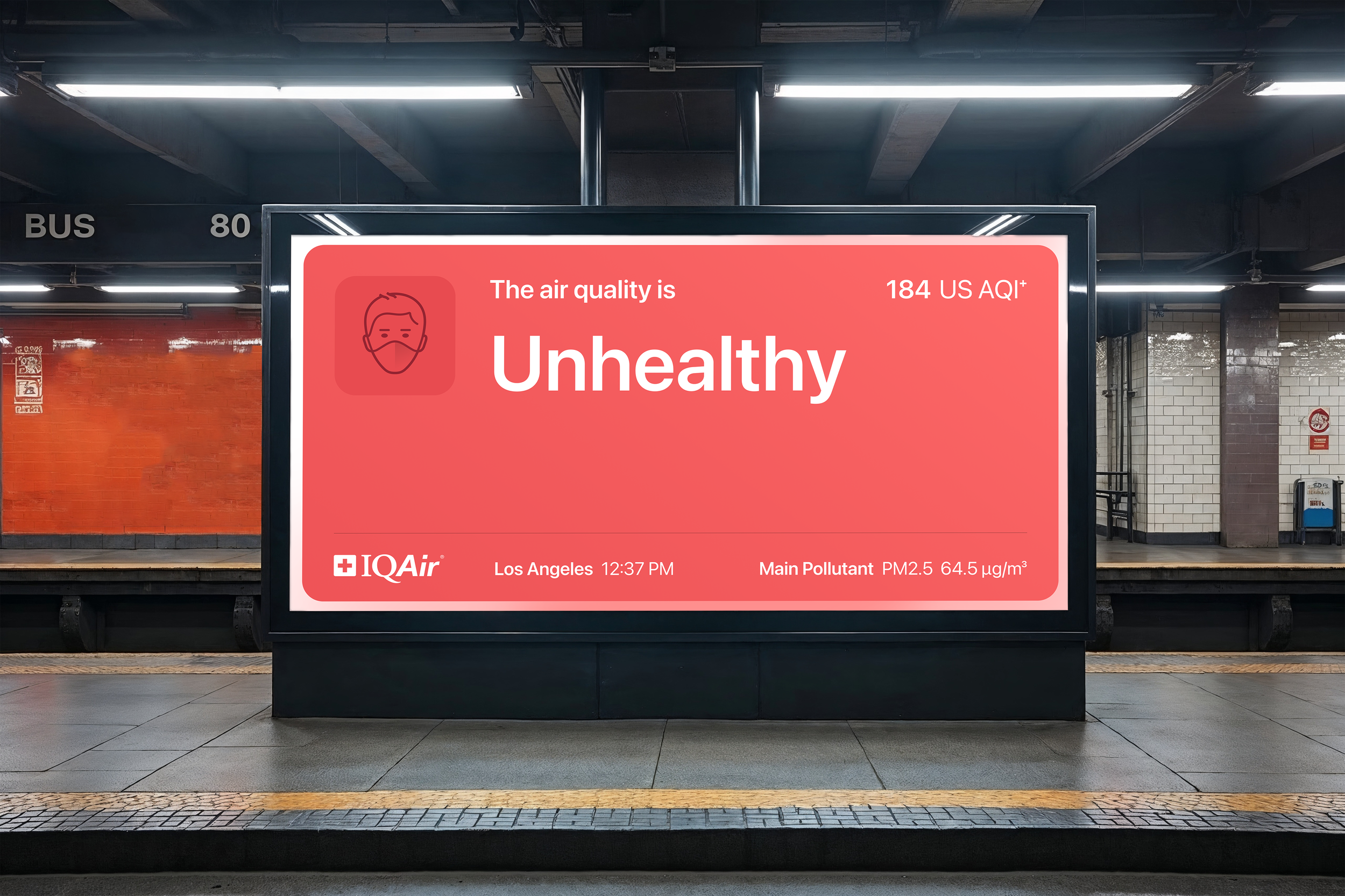
En tant que Lead Product Designer, j’ai initié et structuré l’écosystème visuel d’IQAir depuis zéro : création du design system, conception des interfaces web et mobiles, et élaboration de visualisations de données claires et engageantes. L’objectif était de transformer des données scientifiques complexes sur la pollution de l’air en une expérience utilisateur intuitive et accessible.
CHALLENGERendre l’information complexe compréhensible sans compromettre la rigueur scientifique. Grâce à une hiérarchie claire, un récit visuel fluide et un langage graphique rigoureux, la plateforme est devenue une référence mondiale.
ACCOMPLISSEMENTS CLÉSLa base d’utilisateurs est passée de quelques centaines à plus de 6 millions d’utilisateurs mensuels.
L’application, notée 4,7/5, a été saluée pour sa lisibilité, sa pertinence et sa facilité d’utilisation, et a été mise en avant à plusieurs reprises sur les App Stores.
Le classement de la qualité de l’air que j’ai conçu est régulièrement cité par des médias internationaux majeurs tels que BBC, The Guardian, CNN et Le Monde.
Reconnu comme une plateforme de référence tant par les professionnels que par le grand public pour la prise de décision en matière de santé environnementale.
J’ai développé la carte de qualité de l’air intégrée au site du Programme des Nations Unies pour l’environnement.